Image
Motion
Photo
Designgraphik
Prints
App
Bio
Image
Motion
Photo
Designgraphik
Prints
App
Bio
© 96-2024_
Filed / Image
View
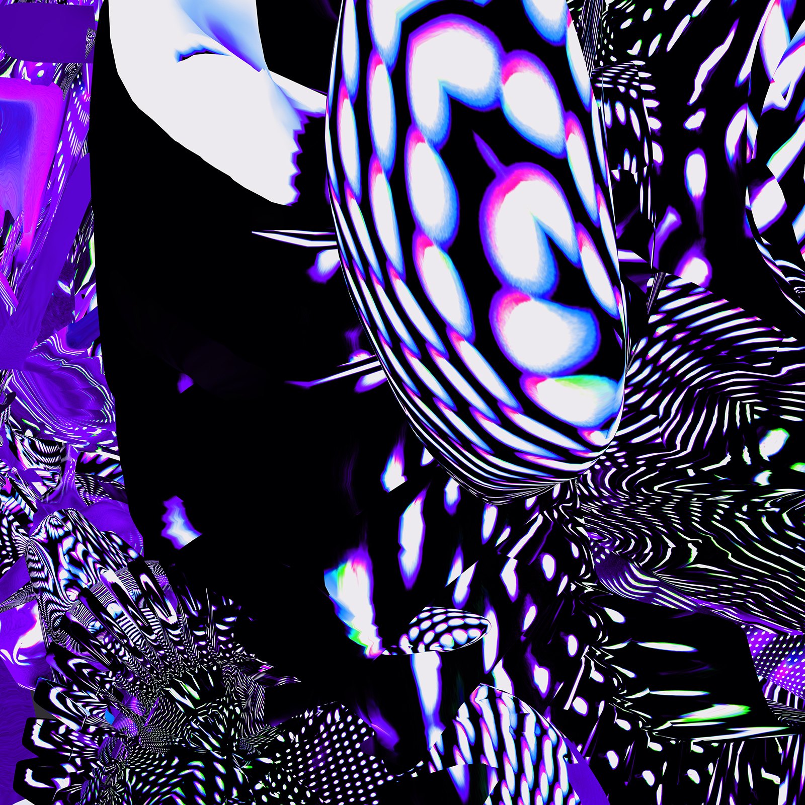
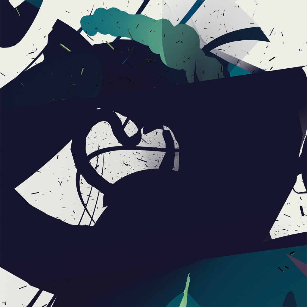
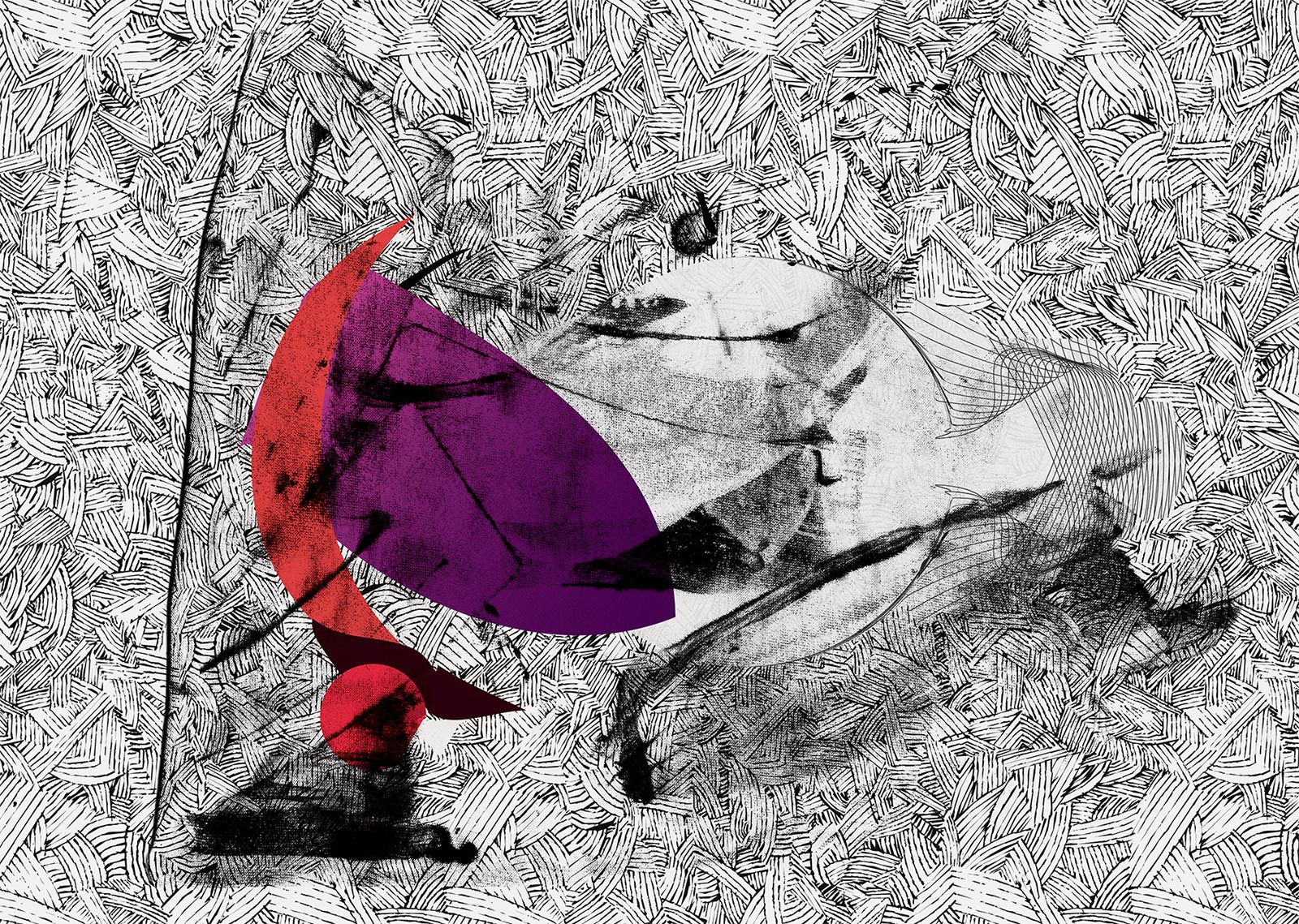
Art For The King
2017
View
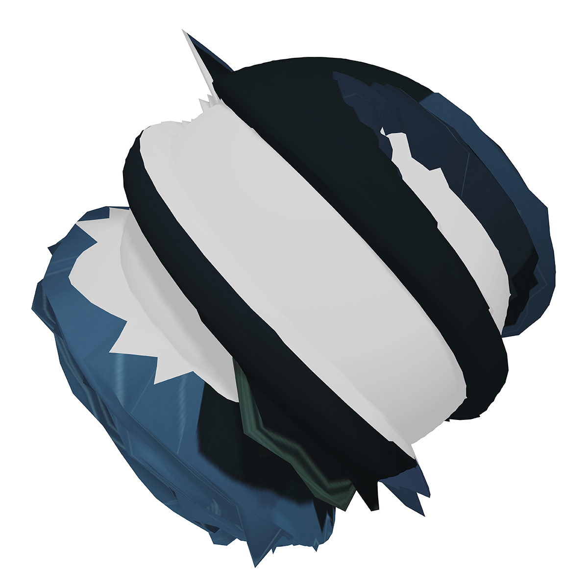
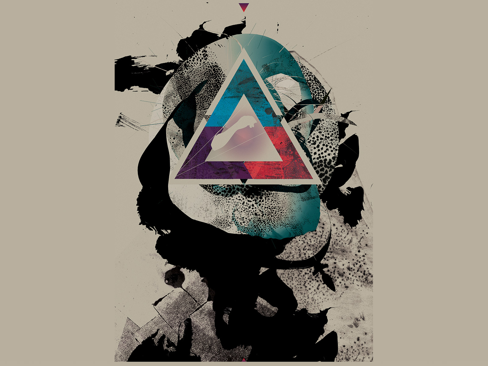
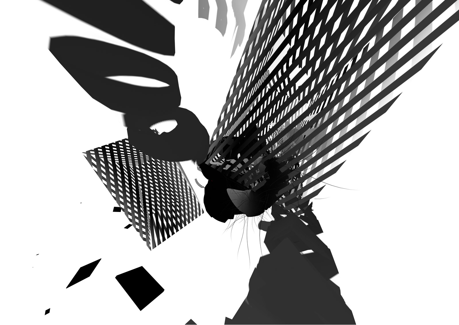
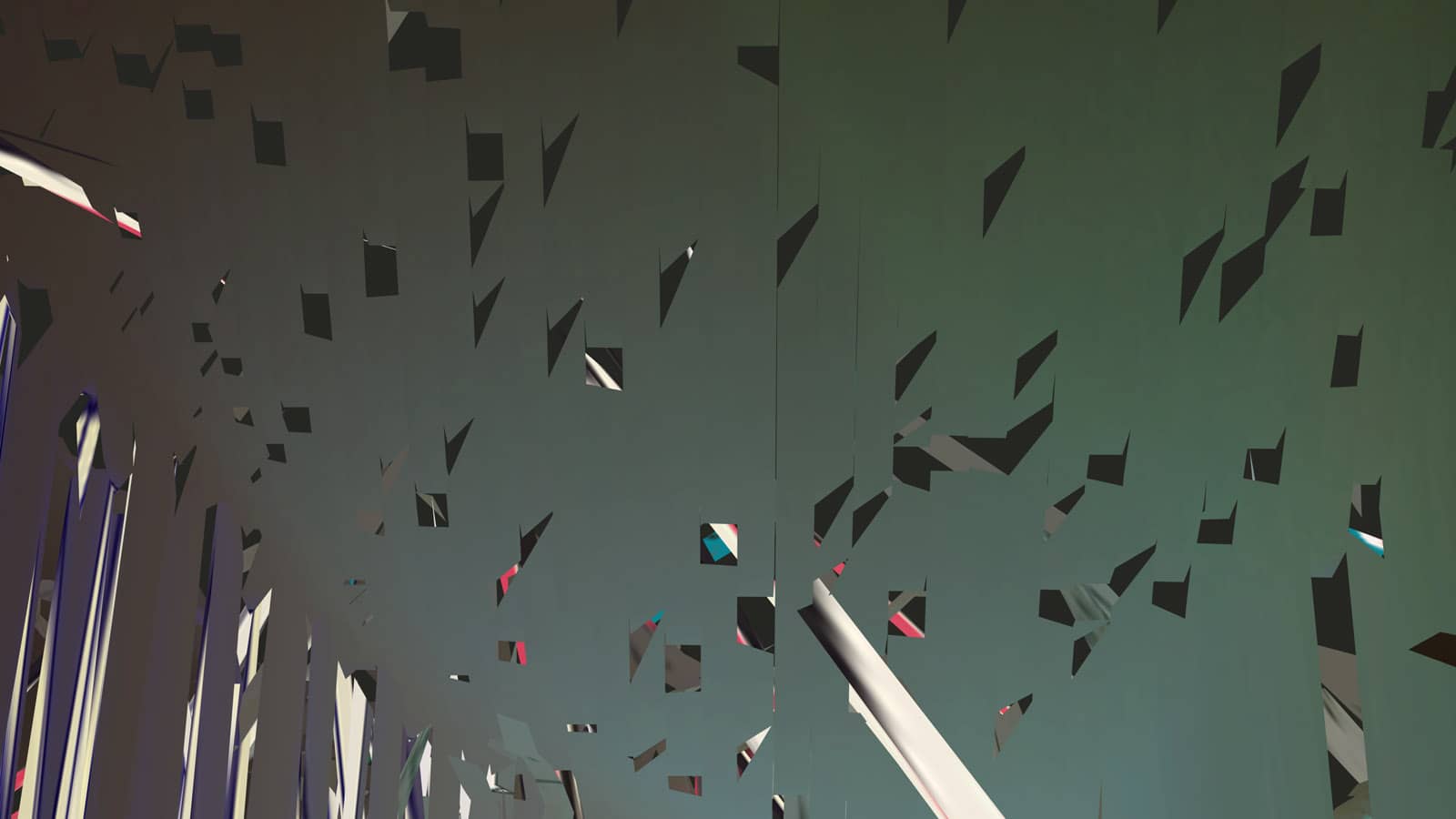
Displaced Forms
2011
View
YWFT QUE
2010
View
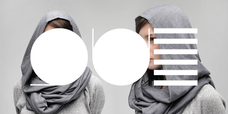
+81 Magazine
2009
View
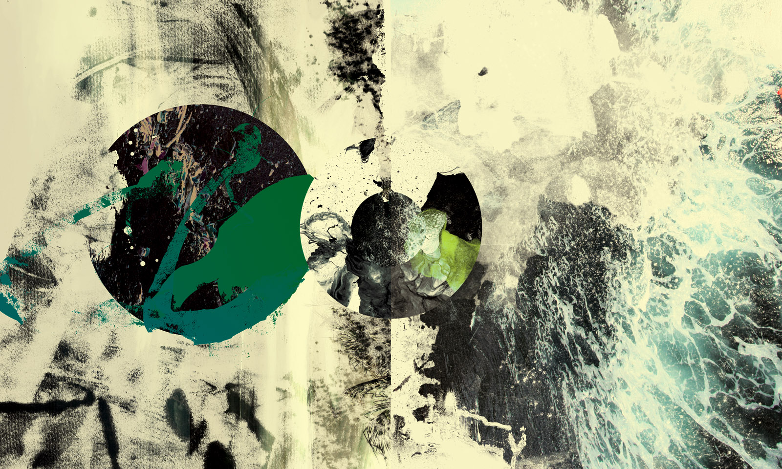
The Interpretation
2009
View
View
10142008
2008
View
Today’s Art 2008
2008
View
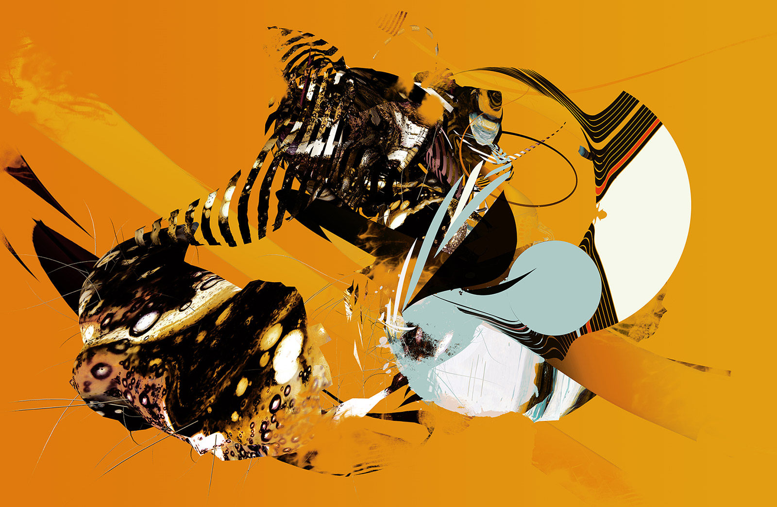
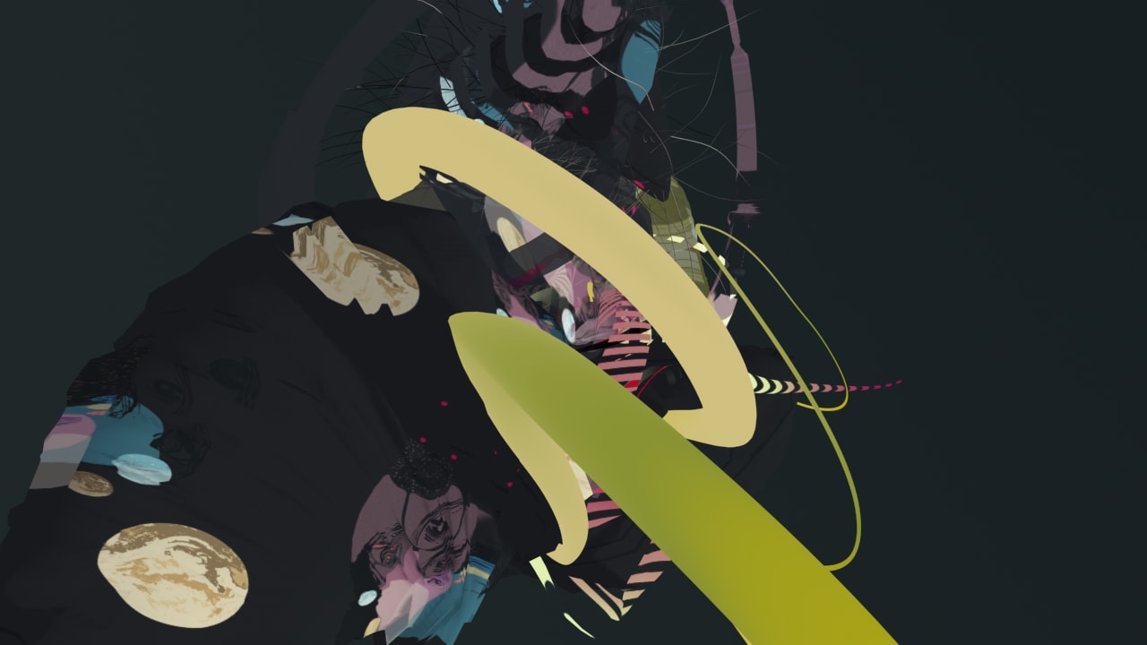
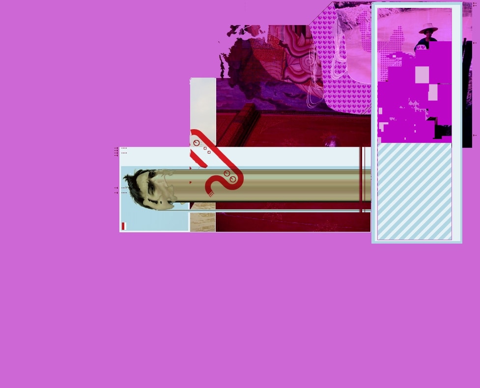
A Billion Lies and a Storm
2008
View
06142008
2008
View
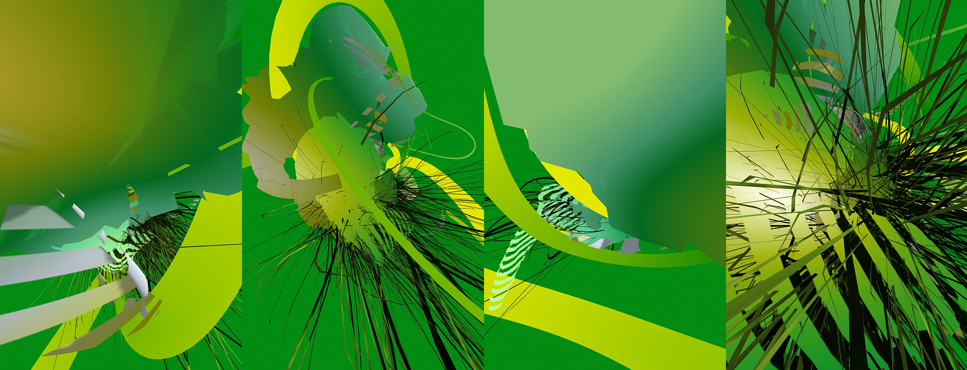
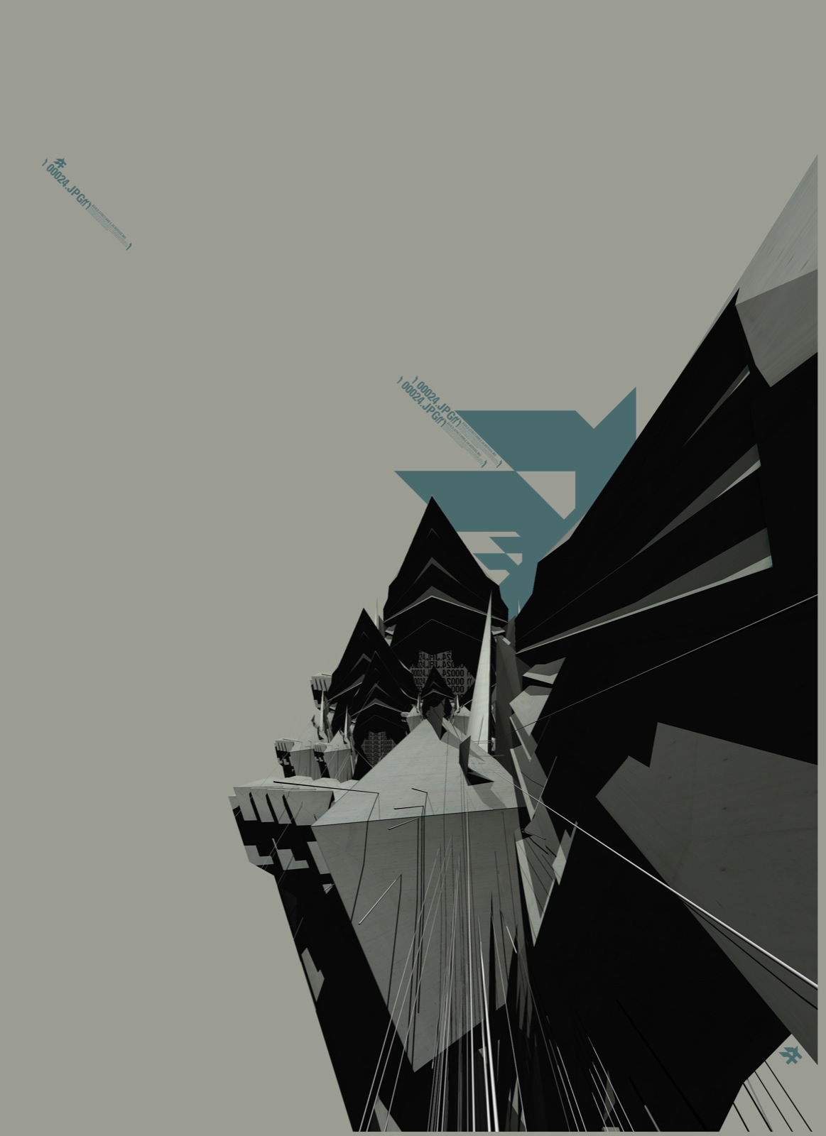
Atlas
2008
View
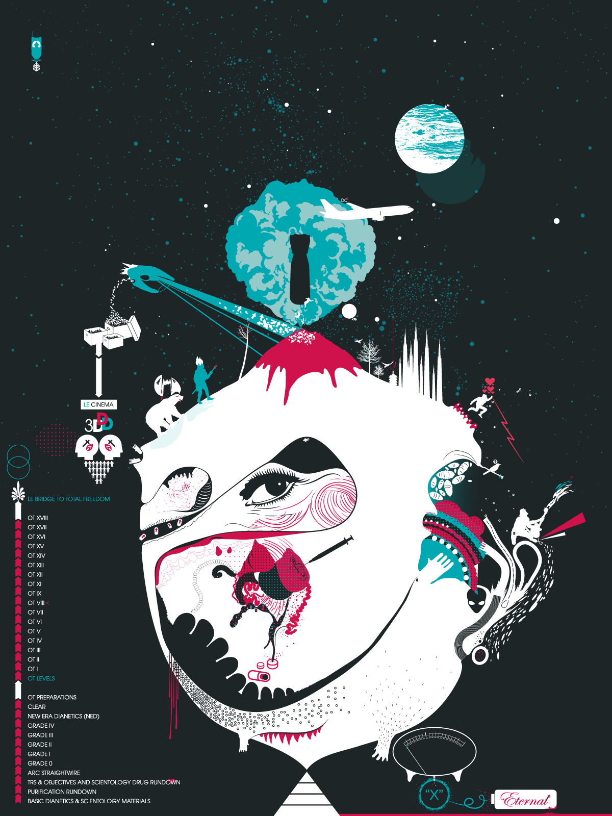
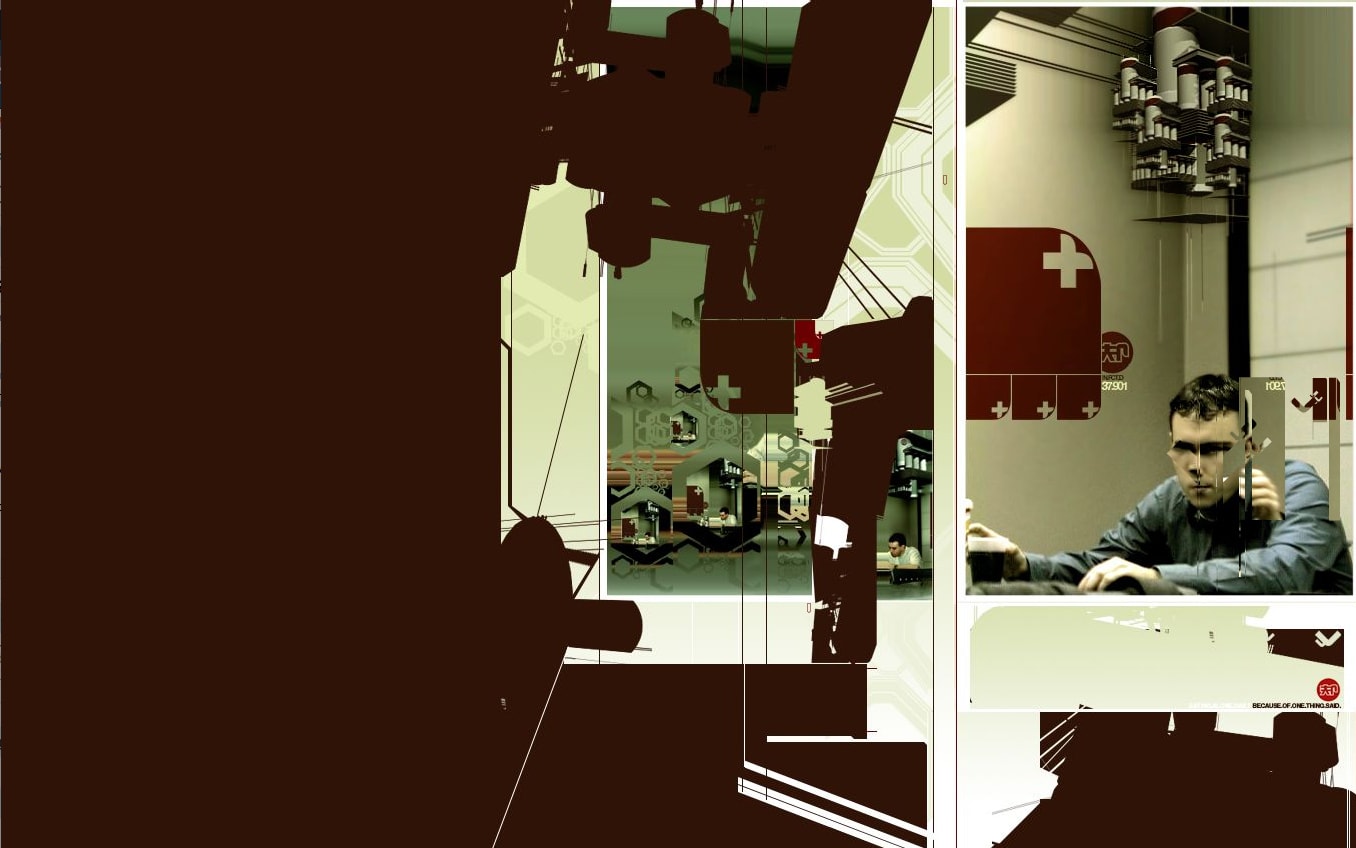
OTIII / Scientology
2007
View
Immanual
2006
View
Designgraphik 05
2001
View
Digital Vision: Infinity
2001
View
Designgraphik 04
2001