It has been said that a strong typeface is made stronger when it is applied to a thoughtfully considered composition. Helvetica, perhaps the strongest of all typefaces, even starred in its own film. But to every thing, there is a season, and we here at YWFT feel that for every beautiful, perfect Helvetica movie starlet, there is a twisted, long-haired, misfit smoking in the bathroom. And so we introduce you to YWFT QUE.
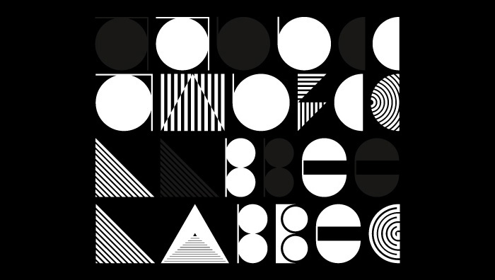
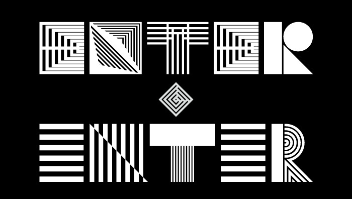
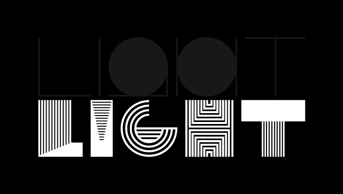
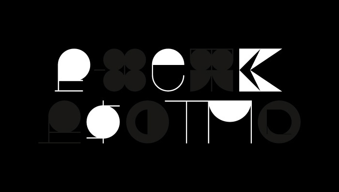
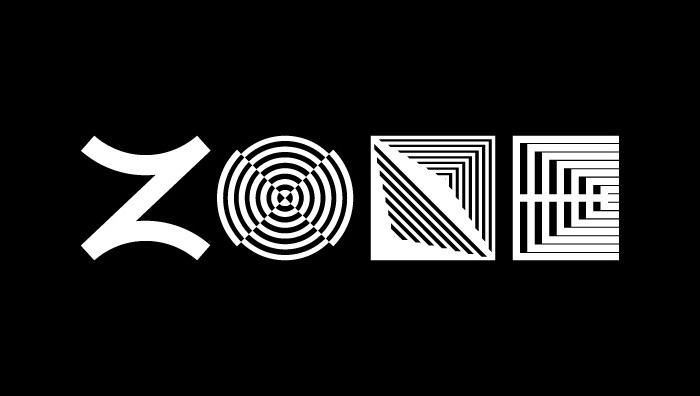
YWFT QUE is a display font that follows a new design mantra: “Conservatively Absurd.” It was developed to be the anti-Helvetica; to send a middle finger to legibility. It snarls at Times New Roman and dropkicks “the norm” out da building. YWFT QUE journeys into the unknown, where sometimes letters look nothing like they should, and kerning has a mind of its own. YWFT QUE will conquer any poster project, sex up any website and take your motion work straight to the top of the World Tango Championships.
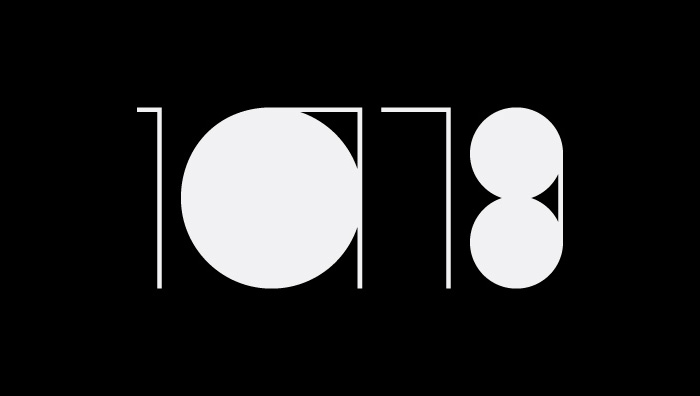
Simply put, it follows no rules. Why sometimes, it’s even impossible to read.
YWFT QUE was originally drawn as the handset ELSE in 2009 by Taechit Jiropaskosol, then re-mixed/designed/formatted to opentype by Michael Paul Young in 2010. Each individual weight contains 240 glyphs, a total of 480 in the complete family.
Download at YouWorkForThem